This is our final project for IAR 110. I enjoyed playing with views of the leaf and various drawing and shading techniques. The drawing on the left side of the second row is a close up of the vein structure--just in case anyone was wondering!
Oops! Blogger STILL won't upload the dang thing. I'll try again later.
Showing posts with label IAR 110. Show all posts
Showing posts with label IAR 110. Show all posts
Monday, December 10, 2007

Thursday, November 29, 2007
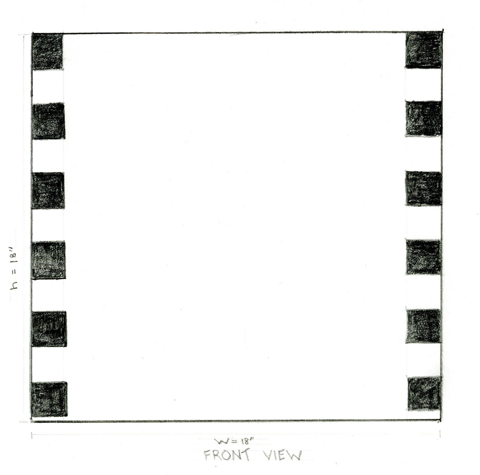
Time Capsule Site and Orthogonal Drawing
Maybe in the office?

Orthogonal drawings of a cube are kind of simple!


Orthogonal drawings of a cube are kind of simple!

Tuesday, November 20, 2007
Tiffany Models for 110 11.20.07
We created a layout for 4 drawings using the techniques we've been working on this semester. Tiffany sat for us as we tried to remember everything we've been learning. I did a contour profile, a negative contour, a blind contour, and a bit of shading.
The layout and the drawings are below. HAPPY THANKSGIVING!


The layout and the drawings are below. HAPPY THANKSGIVING!


Sketch model drawings


Here are the shaded drawings from my sketch models. I think the tall one came out better; the shadows were really well-defined as I drew it.
Process Zine Layout Prototype
Since my time capsule design is a wooden cube with squares and rectangles ornamenting the surface, I wanted these elements in my zine. (Zine is a dumb word!) I found this layout in Birds and Blooms (July 2006).
 It breaks down to 2 rectangles with a title, left justified, (my favorite).
Here is my sketch of it.

I used PowerPoint for my zine and found layouts that are variations of this arrangement. Here's one below.


 It breaks down to 2 rectangles with a title, left justified, (my favorite).
Here is my sketch of it.

I used PowerPoint for my zine and found layouts that are variations of this arrangement. Here's one below.

LeCorbusier shading

This is such a moody, atmospheric picture-my copy certainly didn't do it justice, but it was a great piece to use for practicing shading!
Tuesday, November 6, 2007
Ching Shading Exercises II 11.06.07
These are exercises from Ching Chapter 2. We were working with how to shade based on tonal values of light, reflected light, and shadow. I tried it out first with a candle and wooden spoon.
Not too bad for a first try. It was tricky to get the variations in tone in the big shadow under the objects. I have to learn to break it down into only 1 or 2 variations.

Here's the same still life using pen and random-style shading. It was easier to make subtle changes with this method.
Mapping study. I like the analytical approach of this technique.
 Two showing texture. A part of a waffled yoga mat and a smooth flash drive. I kind of like the way the one on the bottom came out. Looks like two floppy buildings!


Not too bad for a first try. It was tricky to get the variations in tone in the big shadow under the objects. I have to learn to break it down into only 1 or 2 variations.

Here's the same still life using pen and random-style shading. It was easier to make subtle changes with this method.

Mapping study. I like the analytical approach of this technique.
 Two showing texture. A part of a waffled yoga mat and a smooth flash drive. I kind of like the way the one on the bottom came out. Looks like two floppy buildings!

Thursday, November 1, 2007
Ching Shading Exercises 11.01.07
These are 3 drawings exercises from Ching which use shading to transform 2-D objects to 3-D. I enjoyed this exercise. I particularly like the effects of stippling. I had trouble turning the triangle into a cone.


Wednesday, October 24, 2007
Shading 10.23.07 IAR 110
We started working with shading yesterday. Our assignment was to make two drawings, using a different style of shading in each. I've always been amazed at how the slightest variation in shading brings life and dimension to a drawing. I have a LONG way to go.
For these drawings I went very simple: an egg and a yoga block . I used diagonal shading for the egg, and random shading for the block.


For these drawings I went very simple: an egg and a yoga block . I used diagonal shading for the egg, and random shading for the block.


Thursday, October 18, 2007
Zine IAR 110 10.18.07
Our assignment was to create a zine using one of our design research topics as its focus. I chose Interior Spaces, Bedrooms. Bedrooms don't have all the nifty gadgets and widgets of bathrooms and kitchens, and I wanted to look at the ways people approached a space mostly used for sleep, intimacy, and relaxation.
I usually go minimalist in my design and this time I wanted to be a little more abundant. So I often have more than one photo per page and I included the thumbnails and Beatle quotes to add a unifying element and a fairytale-like mood. The result is okay, but not as satisfying as I'd hoped. The need for absolutely, totally straight edges is painfully clear in a couple of places. If I did this again I would either choose a more forgiving layout or I would mark up each page (like we used to do for out high school newspaper and measure every cut and paste to the nearest 32nd inch.


I usually go minimalist in my design and this time I wanted to be a little more abundant. So I often have more than one photo per page and I included the thumbnails and Beatle quotes to add a unifying element and a fairytale-like mood. The result is okay, but not as satisfying as I'd hoped. The need for absolutely, totally straight edges is painfully clear in a couple of places. If I did this again I would either choose a more forgiving layout or I would mark up each page (like we used to do for out high school newspaper and measure every cut and paste to the nearest 32nd inch.


Thursday, October 11, 2007
Composition IAR 110 10.11.07
 Our assignment was to find a 2-page print layout that we liked and duplicate it using our own choice of graphics and text. Our pages focussed on, "What is Studio?". The image I found was in the October 2007 issue of The World of Interiors.
I like the simplicity of the layout and the equal weight given to text and the photo. (The shadowy stuff in the background is bleed through from the scanner. I tried blocking it with paper, but it came through anyway.)
So here's my version. I used their text as a template because I thought it was strong and gave me a good way to describe Studio. I used 4 photos to show different aspects of Studio, but arranged them in a rectangle that roughly imitates the original dimensions. I must have proofed this tiny bit of text (and made minor changes 20 times--yet...can you find the typo?!)

Sunday, September 16, 2007
Contour profiles 9.16.07
I enjoyed doing these so I did a couple of extra. The first one is from Drawing on the Right Side of the Brain. Had a lot of trouble with the mouth and chin--she looks like she swallowed a toad!
Below is a girl who was studying with a group of friends at Barnes and Noble. They left in a big swoosh--so I didn't get a lot of detail. But I think I "got" her nose really accurately.

This is from a photo of me, taken by my father, when I was 5 years old. Too bad you can't tell I'm wearing my red and black fringed cowgirl outfit!
 This is my ever patient and supportive husband--who is a LOT cuter than this!


Below is a girl who was studying with a group of friends at Barnes and Noble. They left in a big swoosh--so I didn't get a lot of detail. But I think I "got" her nose really accurately.

This is from a photo of me, taken by my father, when I was 5 years old. Too bad you can't tell I'm wearing my red and black fringed cowgirl outfit!
 This is my ever patient and supportive husband--who is a LOT cuter than this!
Wednesday, September 12, 2007
Contour Drawing--People
Here are 4 contour stealth drawings of unsuspecting (I hope) folks. I agree with other students that this practice was surprisingly enjoyable. Maybe I expect something close to perfection when drawing immobile squares and rectangles. With bumpy, wrinkly, fidgety people I'm happy for every accurate line!
This is at Smith Street Diner. They have biscuits the size of your head!
 This one and the next are folks in my favorite hang out, Barnes and Noble. (I know, I'm a wild one!)


This is at Smith Street Diner. They have biscuits the size of your head!
 This one and the next are folks in my favorite hang out, Barnes and Noble. (I know, I'm a wild one!)

Monday, September 10, 2007
DowntownContours 9.07
 We were supposed to take a total of two hours on these four sketches, but for me it was six! But again I learned a lot and I'm pleased with these drawings. Thanks to both Jake and Suzanne for encouragement. And thanks a million to Jake for catching my mistake with trying to find angles using my pencil. It kept dipping into the 3rd dimension! He gave me the "pane of glass" image, and it has made a tremendous difference. Yeah! This first drawing is a law office on Elm Street.
 I wanted to find something modern and something simple. This bank is on the corner of Market Street and Murrow Blvd. Very simple lines with a creamy, adobe-like surface.
  Cheesecake by Alex on Elm Street was closed :(. I like the coziness of the small shop and the gathered curtain. Looks very inviting.
 This was my first choice for the downtown contour series. Whoa! I went back 3 times. It definitely challenged me. But I love the building and its place in the GSO arts community so it was fun to do.
Thursday, September 6, 2007
110 Contour Sketch 9.4.07
 Once upon a time, during my first round of college, I decided to switch from an English major (the major for which I was genetically and socially programmed) to Biology. That meant taking Chemistry. And I had no idea what that teacher was yapping about. But for some reason,probably pure stubbornness, I decided I was absolutely, positively going to understand all those symbols and formulas. And though it took some tears and a few temper tantrums, in time I had a revelation. I saw the world as a chemist and it changed the way I looked at everything from a piece of chalk to a poem. Drawing is like chemistry--unknown. And I'm definitely in that frustrating, "I'll never get it" part (though I seem to have outgrown the tantrums!). But I know I'll get to that epiphany and I'll see the world through the eyes of an artist/designer. And I'll get to see chalk and poems in a new way--again.
Monday, September 3, 2007
Blind Contour: My Room

I posted this just because I like it. I was very relaxed and took plenty of time with it. Can you see our cat on the dirty clothes?


Subscribe to:
Posts (Atom)