
Late for the Sky, Jackson Browne, 1974
Photographer: Bob Seidemann
One of my favorite albums and album covers. Late for the Sky is a concept album which explores death and salvation, darkness and light, joy and regret. It is quintessentially American in its use of the road and the car as metaphors.
"I'm just rolling away from yesterday
Behind a wheel of a stolen Chevrolet
I'm going to get a little higher
And see if I can hot-wire reality."
Browne gave Seidemann a print of Magritte's The Empire of Light and asked him to use a similar house with a similar mood, and add a car at the curb. Seidemann calls it the "Los Angelization of Magritte". He found the house for the photo in LA and spent days getting just the right exposure. He wanted the edge of the leaves to be visible in the dusk. The sky was a photo by David Coffin and was edited in to the image. The cover is a study in darkness and light that reflects the content of the album beautifully.

The Dark Side of the Moon, Pink Floyd, 1973
Image: George Hardie
Cover Designers: Storm Thorgerson & Aubrey Powell
VH1: #4 album cover of all time
This is a concept album about the nature of human experience, including themes of time, money, and conflict. The prism on the cover and the inside image of a sound wave moving through a prism symbolizes the work of Pink Floyd in combining light and sound in their concerts. They were "preeminent among all bands" in creating a total sensory experience for eye and ear in their shows. (Could it be that illicit substances ingested by the audience added to the experience?!)

Horses, Patti Smith, 1975
Photographer: Robert Mapplethorpe
Cover Design: Bob Heimall
Patti Smith is a legend in the punk rock/rock music scene. Horses was her debut album. It's first line, "Jesus died for somebody's sins, but not mine," indicate the radical departure from pop music and especially disco that Smith's music represents. She is considered a founder of punk music, putting the sounds and images of Beat poetry to the garage band, raw sound characteristic of the genre. The cover was photographed by her great friend and one-time room mate, Robert Mapplethorpe. His striking photograph captures Smith's paradoxes: her toughness against her elegance and delicacy and her androgynous beauty. These same paradoxes are woven throughout the music in the album. (She co-wroth Because the Night with Bruce Springsteen.)

Born to Run, Bruce Sprinsteen, 1975
Photographer: Eric Meola
Cover Design: John Berg, Andy Engel
This album made Bruce Springsteen, "the Boss". He wanted to "make the best rock and roll album ever made", and he came close. Almost a concept album, the music and lyrics chronicle the restlessness of a life in the gritty, working class streets of New Jersey. The album rocketed Springsteen to national celebrity; he was on the cover of both Time and Newsweek. The front cover is a simple design in black and white with Springsteen in full rock and roll plumage, wild hair, scruffy beard, leather jacket and guitar. He is leaning against part of a person. Upon opening the cover (or flipping it over) we see it is sax player Clarence Clemmons. Hence, we get the primary image of the "star" balanced with Springsteen's desire to have Clemmons on the cover. The raucous, rascally, smiling image of Springsteen and the intense stance ot Clemmons playing sax are a great indication of the music inside the cover.

Abraxis, Santana, 1970
Designer/Artist: Mati Klarwein
Carlos Santans visited Mati Klarwein's studio and immediately knew he wanted the artist's painting, The Annunciation, to be the cover of his 2nd album. It is a surreal depiction of the story of the archangel Gabriel announcing to Mary that she is carrying Jesus the Christ. The model for Mary is Klarwein's girlfriend and the artist himself was the model for Joseph. Gabriel descends from heaven riding on a conga drum. Santana was taken by the colors and the image of the archangel astride congas. He said the art, "...fit like a hand and glove to the music."

Sticky Fingers, The Rolling Stones, 1971 (first release on Rolling Stones label)
Concept and photograph: Andy Warhol
Cover design: Craig Braun
It was Andy Warhol's idea to put a zipper on the cover--surprise! The album was the first after the Stone's violent experience at Altamont. In response they decided to shift from the devil imagery to pure sexuality. The cover scandalized some retailers, who at first refused to carry it, but it delighted fans. The trademark lips and tongue graphic was also introduced on this album. A technical note: When albums shipped with the zipper up, the albums were damaged. Later shipments went out with the zipper down, which only dented the cardboard center of the LP.

Sgt. Peppers Lonely Hearts Club Band, the Beatles, 1967
Cover artist: Peter Blake
Photographer: Robert Fraser
The concept of the Beatle's 8th album is that they are another band, playing a concert. Robert Fraser suggested to Paul McCartney that they use a "fine artist" for the cover. They chose Peter Blake. They decided to do a composite of the faux band surrounded by famous individuals who had just seen their concert (including the Beatles themselves, as wax figures). Robert Fraser took photos of the Beatles in their alter ego garb. Blake spent two weeks constructing the collage from pre-existing images. The boy who delivered the floral arrangements asked if he could make a guitar from some of the flowers, and did so. The overall effect is a surreal, vivid hodgepodge of celebrity, and historic figures, and baroque decorations. Fanciful and a little creepy (e.g. the Shirley Temple figure wearing a "Welcome the Rolling Stones" tee shirt). The music was also a mix of circus tunes, discordant sounds, trippy mind wanderings, and one sad ballad. Pretty great match of cover and music.
The Beatles, the Beatles, 1968
aka: The White Album
Cover design: Richard Hamilton
The release of this album was a long awaited event. It is the only Beatles album which does not have a picture of the Fab Four on the cover. The design by Hamiltion is a huge change from the Beatles previous album, Sgt. Peppers Lonely Hearts Club Band (see above). Hamilton wanted it to be in the conceptual art style, wherein concept and planning are everything, and craft and execution are secondary. The minimalist design included a "stamped", unique serial number on the initial pressings--an ironic statement about having a "numbered edition" of 5 million or more. On the back were photos of the Beatles, portraits by John Kelley. These were also found as 8 X 10 prints inside the cover. The Apple logo is on the center of each of the LPs. The change in cover design signalled a change in the music. Despite melodic tunes like Blackbird, much of the music had a harder, more anarchical edge to it. Charles Manson even found inspiration in Helter Skelter. This 9th album from the Beatles was a masterpiece of reflecting the ideals of the '60s, while also exposing the anger and chaos of the period.

Cheap Thrills, Big Brother and the Holding Company (Janis Joplin), 1967
The cover art is by Robert Crumb (R. Crumb). He and Janis Joplin were friends. Crumb founded the underground comix movement with characters such as Mr. Natural, Fritz the Cat (an X-rated comic), and the "Keep on Trucking" guy.
Joplin is in the circle in the middle and each cell has either a song title and image related to it or info on the band and the location of live material in the album. On the far right is a great depiction of "Janis Joplin vocal". The original album title was Sex, Dope, and Cheap Thrills, but the record company nixed that idea.

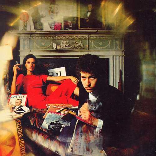
Bringing It All back Home, Bob Dylan, 1965
Photographer: Daniel Kramer
Dylan caused an uproar when he played an electric guitar at the Newport Folk Festival. Many followers felt betrayed by the man they considered a poet and prophet. Side A of BIABHSeeger. But now, we have a sophisticated Dylan, almost Edwardian in dress, paired with a sophisticated woman (his managers wife, Sally Grossman), in front of a classical mantel, sitting in a leather chair. The artifacts reference the songs, particularly, is acoustic, but Side B is electric, Dylan's first electric recording. Both Dylan and the recording company, Columbia, recognized that the cover art needed to reflect this dramatic change in Dylan's music, the "emergence of a new rock-laden and quasi-psych influenced change of course". (It was the first Columbia cover that did not list song titles on the front.) Dylan chose to work with his friend, photographer Daniel Kramer to create a new image. Previous covers had been black and white or fairly monochromatic affairs with the folksinger and his guitar (and in one, a girl). He looked working class in the mold of Woody Guthrie and Pete She Belongs to Me. There are 3 albums in the photo. One by Robert Johnson (a famous Delta Blues man), one by Eric vonGrossman, Dylan's previous album, Schmidt( a folk-blues guitarist and artist), and, tucked in behind Sally Don't Look Back. Kramer also points to the use of rich, saturated layers of color as the symbol of the "technicolor" of Dylan's new sound.

Cheap Thrills, Big Brother and the Holding Company (Janis Joplin), 1967
The cover art is by Robert Crumb (R. Crumb). He and Janis Joplin were friends. Crumb founded the underground comix movement with characters such as Mr. Natural, Fritz the Cat (an X-rated comic), and the "Keep on Trucking" guy.
Joplin is in the circle in the middle and each cell has either a song title and image related to it or info on the band and the location of live material in the album. On the far right is a great depiction of "Janis Joplin vocal". The original album title was Sex, Dope, and Cheap Thrills, but the record company nixed that idea.
Bringing It All back Home, Bob Dylan, 1965
Photographer: Daniel Kramer
Dylan caused an uproar when he played an electric guitar at the Newport Folk Festival. Many followers felt betrayed by the man they considered a poet and prophet. Side A of BIABHSeeger. But now, we have a sophisticated Dylan, almost Edwardian in dress, paired with a sophisticated woman (his managers wife, Sally Grossman), in front of a classical mantel, sitting in a leather chair. The artifacts reference the songs, particularly, is acoustic, but Side B is electric, Dylan's first electric recording. Both Dylan and the recording company, Columbia, recognized that the cover art needed to reflect this dramatic change in Dylan's music, the "emergence of a new rock-laden and quasi-psych influenced change of course". (It was the first Columbia cover that did not list song titles on the front.) Dylan chose to work with his friend, photographer Daniel Kramer to create a new image. Previous covers had been black and white or fairly monochromatic affairs with the folksinger and his guitar (and in one, a girl). He looked working class in the mold of Woody Guthrie and Pete She Belongs to Me. There are 3 albums in the photo. One by Robert Johnson (a famous Delta Blues man), one by Eric vonGrossman, Dylan's previous album, Schmidt( a folk-blues guitarist and artist), and, tucked in behind Sally Don't Look Back. Kramer also points to the use of rich, saturated layers of color as the symbol of the "technicolor" of Dylan's new sound.
1 comment:
Great job with your design research! I especially appreciate this entry. It's so interesting reading the story behind these iconic covers.
Hope you have a wonderful break. Thank you for all your work and energy this semester.
Post a Comment