This is our final project for IAR 110. I enjoyed playing with views of the leaf and various drawing and shading techniques. The drawing on the left side of the second row is a close up of the vein structure--just in case anyone was wondering!
Oops! Blogger STILL won't upload the dang thing. I'll try again later.
Monday, December 10, 2007
Saturday, December 8, 2007
Sustainability
Sustainability implies equilibrium in a system. A system can be a simple chemical reaction, an old growth forest, or our solar system. The inputs and outflows need to balance (be in equilibrium) in order to maintain the conditions that allow survival of the system. Equilibrium can be destroyed by too much or too little. For example, lack of food will eventually result in death for any plant or animal. On the other hand, too much CO2 in the Earth's atmosphere threatens to change climate in ways that threaten multiple species and ecosystems. The acceptance (finally!) of global warming, and to a lesser extent the acknowledgement of the political and environmental dangers of oil dependency, have led to the realization that we must think about sustainability in personal, economic, and political decisions.
It is important to look at the big picture of resource use, rather simply jumping into "green" trend. Designers will take on roles as educators and advocates in the implementation of sustainable design in built environments.
(For this entry the terms sustainable, green, eco-friendly, and such will be used interchangeably.)
Many magazines, both design and general publications, have articles pertaining to green design, green living, and green products. Natural Home, Innovative Home, and Dwell are examples of publications that focus mostly on how to make individual homes and neighborhoods eco-friendly. Natural Home covers remodels and new buildings which use sustainable design, as well as some articles on energy efficiency and living off the grid. It features many organic and sustainably produced products, from linens to flooring. Gardening articles and recipes are included in some issues.
Dwell's emphasis is on prefabricated homes, both urban and rural. The homes are generally sleek, modern structures. Most have multiple sustainable features, and most are relatively modest in size. However, these are mostly very expensive homes for early adopters of new technologies.
Innovative Home has recently changed its focus to "green building and modern design". While it is geared to the individual home and neighborhoods, it is a bit more technical than Dwell or Natural Home. The current issue has an article on transmaterials (see my entry, "2 + 1 Technologies"). Each of these three magazines is written for readers who have some basic knowledge about sustainability. Many general/home/women's interest magazines such as Better Homes and Gardens and Family Circle feature articles with more elementary information--such as recycling, using cloth bags at the grocery store, and sealing drafts from windows and doors. For all of these magazines, sustainability is a more or less personal issue limited to your house, your neighborhood.
Solar Today concentrates on solar technologies, as well as issues like water use and transportation. Most of the focus is on the use of solar design for buildings. A recent issue defines sustainability. "Buildings that address energy and environmental ... factors, we dubbed sustainable design" because they "lessen our impact on the environment".
An article in this month's popular science magazine, Discover, discusses a new prefabricated house. It is part of an exposition in San Francisco, called West Coast Green. It is the first fully manufactured iteration of Michael Kaufmann's mkLotus house. Besides using all sustainable materials, the home has a "living roof". Off site construction reduces waste by 75%, and its small, 700 sq. ft. size makes for a small carbon footprint. With a BIG cost! $294.00 which, according to the article is double the square foot cost of 93% of all new homes in the U.S.
This is an example of the downside of sustainable design. There is a perception that it is only for the rich, and that has been a mostly accurate assessment until now.
This month's UTNE Reader includes an article on sustainable design that is affordable, even in low income housing. It also has a piece on one of the pitfalls of the trendiness of "green" everything. Mick Dalrymple, creator of the PBS TV show, Build It Green, discussed the idea that living in a way that will support the health of ourselves and the planed is not about buying lots of green stuff. He argues that we must look at whole systems. That means sighting buildings to take advantage of daylight, breezes, opportunities for passive solar. And we have to take in to consideration the size of our homes. A McMansion full of sustainable products is no environmental bargain.
Plenty Magazine moves from the local scene of Natural Home, et al, and gets global. Topics in the current issue include: eco-friendly banks (who knew!), an interview with Amory Lovins on the national and global advantages of energy and resource efficiency, transportation systems, food, and wind technology. A cover story is "Function Over Form", a conversation with solar pioneer Travis Price. Price is a critic of LEEDS. Although he sees some advantages, he desires and architecture that it more than a "checklist" of insulation thicknesses and such. He thinks LEEDS makes for engineering, not architecture. He also thinks it crushes free trade and innovative thinking. For example, it galls him that architects must buy local or regional products. He says, "You can't impede bringing in Plybo0 (a sustainable, hardwood flooring) from China because it's not local. That's hippie-dippie talk." He sees two real environmental problems: suburban sprawl and the export of the American way of life to countries like China and India. He wants an architecture that arises from our deep connection to the natural world, an "architecture of the spirit" which incorporates stillness, movement, and nature. All in all he wants not just checklist sustainability, but a philosophy of design that gives rise more organically to structures that connect us to nature.
Finally, Urbanland, from the Urban Land Institute, looks at sustainability as an issue of urban planning. The philosophy is summed up by Sim Van der Ryn, president of the Ecological Design Institute in Sausalito, CA. He proposes, "Surpassibility [as a] form of ecological design that minimizes environmentally destructive impacts by integrating itself with living processes. [emphasis mine] While green building tends to focus primarily on the energy consumption of a particular structure, ecological design extends that focus to the structure's effect on the environment."
So sustainability is the buzz word right now. It has it's roots in basic biology and the idea of systems in equilibrium. I hope the idea of sustainability is not a fad and that it will become a part of our thinking and doing. Clearly, current media use the term in ways both small (recycle your paper) to large (it is involves a global paradigm shift).
Transmaterials
Innovative Home Design (winter 2007) has a report on transmaterials. These are defined as materials that combine "technological ingenuity and artistic vision" to help us function and connect with the world in ways that are healthy, functional, and aesthetically pleasing.
Three materials that seem particularly interesting are: Reben, Power Plastic, and a Mirror Duct System for daylighting.
Reben is a wallcovering that falls somewhere between paint and wall paper. It is made of all natural materials, is nontoxic (even edible!), and is said to clean the air. The name means "alive" in German, although the product was developed by the Suzuran Corporation which is headquartered in Japan. The ingredients include: powdered Japanese washi paper which controls humidity by absorbing moisture in the summer and allowing it to evaporate in the winter; powder made from scallop shells that prevents the growth of mold and bacteria, and acts as a flame retardant; and titanium dioxide which deodoizes the air and absorbs pollution when the surface is hit with light.
The makers claim Reben is a durable material that performs better than wallpaper. It comes in a variety of textures and colors, and with integrated natural grasses. The "surface conveys a plaserlike richness."
 Power Plastic
Power Plastic: This is a really interesting product that may make solar power much more attractive, economically and aesthetically, to builders and building owners. This photovoltaic technology uses lightweight, organic materials (inorganic silicone has been used in the past) to make thin films that can be layered onto a variety of plastics using relatively inexpensive, mass production processes similar to ink-jet or screen printing. The cost is low, the flexibility of the plastic allows for a variety of applications, and the films use a wider range of the light spectrum than conventional solar cells. Power Plastic can be manufactured in an array of sizes and shapes. It is one of the many nanotechnologies being developed in everything from make-up to --well-- solar energy. Konarka Technologies, Inc. produces Power Plastic. Their home office is in Lowell, MA.
Mirror Duct System for Daylighting: This product looks similar to traditional HVAC ductwork. However the inside is lined with aluminum mirrors which reflect and extend light "as much as 60 feet inside a structure". This is another product of a Japanese-based firm, Material House Company, Ltd. The technology is entirely passive, using no energy (beyond what it takes to manufacture it). It reduces the need for artificial light and for the cooling often needed as a result of heat generated by lights, thus decreasing electrical energy use and CO2 emissions.
Three materials that seem particularly interesting are: Reben, Power Plastic, and a Mirror Duct System for daylighting.
Reben is a wallcovering that falls somewhere between paint and wall paper. It is made of all natural materials, is nontoxic (even edible!), and is said to clean the air. The name means "alive" in German, although the product was developed by the Suzuran Corporation which is headquartered in Japan. The ingredients include: powdered Japanese washi paper which controls humidity by absorbing moisture in the summer and allowing it to evaporate in the winter; powder made from scallop shells that prevents the growth of mold and bacteria, and acts as a flame retardant; and titanium dioxide which deodoizes the air and absorbs pollution when the surface is hit with light.
The makers claim Reben is a durable material that performs better than wallpaper. It comes in a variety of textures and colors, and with integrated natural grasses. The "surface conveys a plaserlike richness."
 Power Plastic
Mirror Duct System for Daylighting: This product looks similar to traditional HVAC ductwork. However the inside is lined with aluminum mirrors which reflect and extend light "as much as 60 feet inside a structure". This is another product of a Japanese-based firm, Material House Company, Ltd. The technology is entirely passive, using no energy (beyond what it takes to manufacture it). It reduces the need for artificial light and for the cooling often needed as a result of heat generated by lights, thus decreasing electrical energy use and CO2 emissions.
Thursday, November 29, 2007
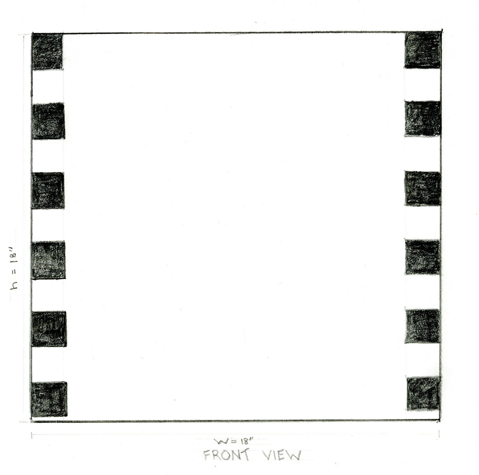
Time Capsule Site and Orthogonal Drawing
Maybe in the office?

Orthogonal drawings of a cube are kind of simple!


Orthogonal drawings of a cube are kind of simple!

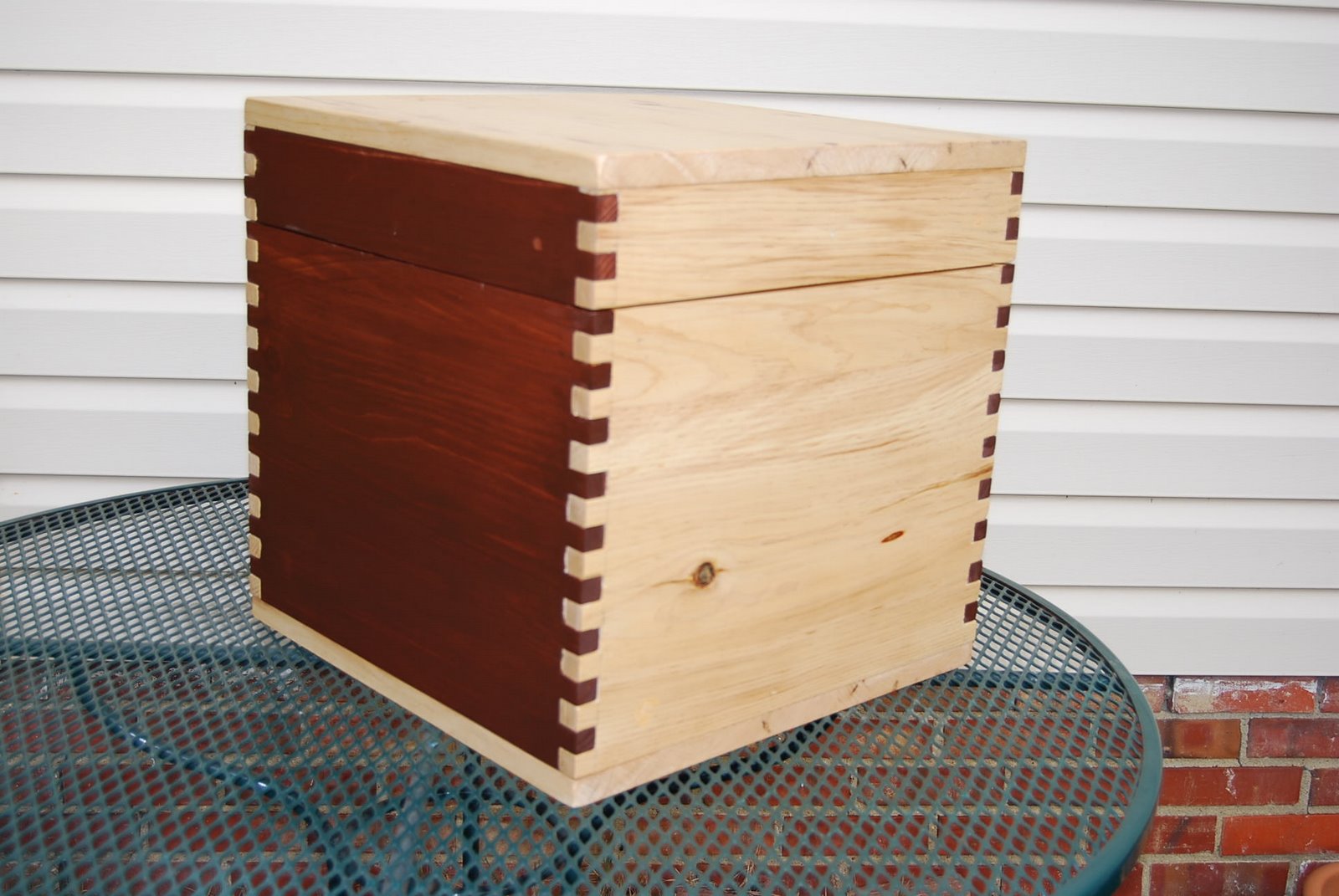
Making the Time Capsule--Full Scale
This is the first time I've constructed anything from wood. Fortunately I have a patient and skilled teacher--thanks Gary! I couldn't do it without him. He watches my every cut! Below is a log of the process of making the bench/time capsule.
Saturday November 24: For the bench sides (18" each), I needed to build the width by cutting a 12" pine board into one 52" (18 X 4) by 12" piece and 2 52" X 6" pieces. To do this I first planed the board to 3/4", and then used a jointer to get an even edge. With a straight edge I could then use the table saw to cut to width. Then we glued these pieces together to create one long board measuring 52" X 18". Once glued we used bar clamps to secure the pieces and left them to set over night. I can cut this into fourths and voila! 4 sides are ready to go. The whole process took about an hour.
 Clamps hold glued pieces together
Sunday November 25: Today was the really fun, meticulous part -- making the box joints. I removed the clamps from the strips and cut them to size (4 sides at 18" X 16 1/2" each). There are all sorts of routers made specifically for box joints, but I don't have any of them! So we used Gary's table saw. We used a dado blade set at 3/4" and fashioned a jig for the miter gauge. (See pictures below.) The jig has to be made so that the joints can be cut accurately and precisely. Designing, cutting, and testing the jig and setting the proper blade height took up most of the time I worked today, but it made the actual cutting of the box joints pretty easy. The fit of the joints was a bit tight. Since glue would make it even tighter I filed down the horizontal surfaces a bit. Again thanks to Gary for helping me with all this--it was totally new to me! Besides the box joints, I also made the top and bottom panels.
The last work of the day was to cut the rabbets that will be support the interior structure of the bench.
 Pieces marked for cutting box joints
 Setting up the jig
 Cutting the notches for the box joints
 Ready to join the pieces
 It's a Cube!
Tuesday November 27: Today I dry fit the box and cut off the top. Scary! It meant cutting through each of the 4 sides with the table saw--guiding a 3-dimensional cube over the saw--which was a little tricky, but it worked.
I used the band saw to cut notches in the plywood pieces for the interior and cut the top of the false bottom.
Wednesday November 28: I stained the darker sides of the box, using Minwax, water-based stain in Rosewood. It's a deep, rich brown. Then I laid on a coat of water-based polyurethane, also Minwax, on the unstained pieces. I masked the pieces I stained, but I got a bit of bleed through which I had to sand off.
 A stain test. I chose Minwax water-based in Rosewood
 Pieces masked for staining
What I've Learned: Since my concept and the structure were simple I challenged myself by making a full scale model from wood. The whole process was new to me (with the exception of sanding and staining). I learned how to make a jig and use it to make box joints. And I used a variety of power tools, hand tools, and clamps. In general, I found it much easier to get straight lines and true 90 degree corners with woodworking tools than it was when we worked with paper and fiberboard and xacto knives. I still had some mistakes, mostly at the points where edges joined. If I make a few more (which I intend to do--it's lots of fun!) I'm sure the craftsmanship would improve. Two more things: 1) power tools are not made for people who are 5' 4 3/4" tall. I had to do some awkward reaching, and 2) fleece attracts sawdust and woodchips like crazy. I'll wear a less nubby sweatshirt next time!
The completed project The lid construction
 The completed, stained box joints
Tuesday, November 20, 2007
Tiffany Models for 110 11.20.07
We created a layout for 4 drawings using the techniques we've been working on this semester. Tiffany sat for us as we tried to remember everything we've been learning. I did a contour profile, a negative contour, a blind contour, and a bit of shading.
The layout and the drawings are below. HAPPY THANKSGIVING!


The layout and the drawings are below. HAPPY THANKSGIVING!


Sketch model drawings


Here are the shaded drawings from my sketch models. I think the tall one came out better; the shadows were really well-defined as I drew it.
Time Capsule Process Booklet
We shall not cease from exploration
and the end of our exploring
will be to arrive where we have started
and know the place for the first time.
T. S. Eliot
Little Gidding/
Four Quartets
and the end of our exploring
will be to arrive where we have started
and know the place for the first time.
T. S. Eliot
Little Gidding/
Four Quartets

This is my booklet for the process of developing my idea for a time capsule for IAR first year students. I chose interlocking "puzzle pieces" for the outside to reflect my chosen concept, community and the idea that "the whole is greater than the sum of its parts". (These pieces aren't included in the scale model due to material availability, but you can see the idea in my sketch models.)
The cube shape is a fundamental form for design now and had been throughout history. Most buildings, furniture, and much ornamentation are made up of one or more cubes or rectangular prisms (except for Frank Gehry's and e.s.!) Cubes have special meaning to the 1st years as well!
I designed a small bench that is easy to move because the time capsule has to be here for 20 years. I wanted it to be useful and portable.
The top opens so that artifacts can be tucked away until the big reunion.


Process Zine Layout Prototype
Since my time capsule design is a wooden cube with squares and rectangles ornamenting the surface, I wanted these elements in my zine. (Zine is a dumb word!) I found this layout in Birds and Blooms (July 2006).
 It breaks down to 2 rectangles with a title, left justified, (my favorite).
Here is my sketch of it.

I used PowerPoint for my zine and found layouts that are variations of this arrangement. Here's one below.


 It breaks down to 2 rectangles with a title, left justified, (my favorite).
Here is my sketch of it.

I used PowerPoint for my zine and found layouts that are variations of this arrangement. Here's one below.

LeCorbusier shading

This is such a moody, atmospheric picture-my copy certainly didn't do it justice, but it was a great piece to use for practicing shading!
Friday, November 16, 2007
Boston
I have seen some terrific design up here and I keep wishing the class was here to see it! The new WGBH facility and the Boston Children's Museum (BCM) stand out as wonderful examples of design, technology, and sustainability focused toward creating a pleasurable and highly functional environment to people. The BCM has LEEDS gold certification (see this) and it's a great example of preservation. It was originally a warehouse. They have retained the brick walls in most places as well as the wooden columns. Wood from columns that had to be removed was used for the reception area desks and flooring. The rooftops are planted with sedum--planted by children and the water is used in toilets and for irrigation of gardens. Beyond the "green" features I was so impressed by the care with which every space was planned for young children and their families. This is a museum that also functions as a gathering place for families. There's just too much good stuff to cover it all here but I left so excited that a place could incorporate the absolute best of design, sustainability, and the best educational and community-building practices. Sooo inspiring. Any one who wants to design for children, children's theater (they have one), education, or museums should visit this building.
WGBH the public radio and TV station in Boston also has an amazing new (and huge space). One wonderful thing was that their materials and even some structures were very much like those used in IARC's Lowenstein exhibit. Any student who worked on that project could have worked on these spaces. The architects were Polshek Partners. Again the designers not only created spaces that work for the staff, but they are also available for the community. The neighborhood where WGBH is located is celebrating 100 years and WGBH is sponsoring a huge party at their facility. Even the radio broadcast studio is observable from the street through special sound proof window. Very cool.
Our hotel is also quite a building but the designers weren't totally sensitive to things like noise levels in public spaces. Still it has some very cool features, like a Japanese inspired lighting array beside the bed and every technology hook-up device currently available. Take a look.
Tuesday, November 6, 2007
Ching Shading Exercises II 11.06.07
These are exercises from Ching Chapter 2. We were working with how to shade based on tonal values of light, reflected light, and shadow. I tried it out first with a candle and wooden spoon.
Not too bad for a first try. It was tricky to get the variations in tone in the big shadow under the objects. I have to learn to break it down into only 1 or 2 variations.

Here's the same still life using pen and random-style shading. It was easier to make subtle changes with this method.
Mapping study. I like the analytical approach of this technique.
 Two showing texture. A part of a waffled yoga mat and a smooth flash drive. I kind of like the way the one on the bottom came out. Looks like two floppy buildings!


Not too bad for a first try. It was tricky to get the variations in tone in the big shadow under the objects. I have to learn to break it down into only 1 or 2 variations.

Here's the same still life using pen and random-style shading. It was easier to make subtle changes with this method.

Mapping study. I like the analytical approach of this technique.
 Two showing texture. A part of a waffled yoga mat and a smooth flash drive. I kind of like the way the one on the bottom came out. Looks like two floppy buildings!

Sunday, November 4, 2007
10 Graphic/Media (Album Covers
Since the 1950's LP album covers were often used as an artistic expression of the music on the record. (Note: The LP-- or long playing record- is a vinyl disk approximately 12 inches in diameter. When placed on a turntable-- a padded circular plate that spins round at 33 1/3 revolutions per minute--and scraped by a needle--these black disks produced the sounds recorded onto them.) The apex of album art was arguably in the late 1960's and '70's (before the scourge of cassette tapes). An album had 244 square inches on the front and another on the back that is dedicated to art, a list of songs, and inside information on the band/performer. Some albums opened up like a book for another 1 foot (!) of area that could be used for art and text. I remember buying albums at the Record Bar in the North Hills Mall in Raleigh. The ride home was spent trying to "hear" what was on the record by looking at the cover. Downloading just doesn't offer the same thrill. So--here are 10 iconic album covers from that era. Enjoy.

Late for the Sky, Jackson Browne, 1974
Photographer: Bob Seidemann
One of my favorite albums and album covers. Late for the Sky is a concept album which explores death and salvation, darkness and light, joy and regret. It is quintessentially American in its use of the road and the car as metaphors.
"I'm just rolling away from yesterday
Behind a wheel of a stolen Chevrolet
I'm going to get a little higher
And see if I can hot-wire reality."
Browne gave Seidemann a print of Magritte's The Empire of Light and asked him to use a similar house with a similar mood, and add a car at the curb. Seidemann calls it the "Los Angelization of Magritte". He found the house for the photo in LA and spent days getting just the right exposure. He wanted the edge of the leaves to be visible in the dusk. The sky was a photo by David Coffin and was edited in to the image. The cover is a study in darkness and light that reflects the content of the album beautifully.

The Dark Side of the Moon, Pink Floyd, 1973
Image: George Hardie
Cover Designers: Storm Thorgerson & Aubrey Powell
VH1: #4 album cover of all time
This is a concept album about the nature of human experience, including themes of time, money, and conflict. The prism on the cover and the inside image of a sound wave moving through a prism symbolizes the work of Pink Floyd in combining light and sound in their concerts. They were "preeminent among all bands" in creating a total sensory experience for eye and ear in their shows. (Could it be that illicit substances ingested by the audience added to the experience?!)

Horses, Patti Smith, 1975
Photographer: Robert Mapplethorpe
Cover Design: Bob Heimall
Patti Smith is a legend in the punk rock/rock music scene. Horses was her debut album. It's first line, "Jesus died for somebody's sins, but not mine," indicate the radical departure from pop music and especially disco that Smith's music represents. She is considered a founder of punk music, putting the sounds and images of Beat poetry to the garage band, raw sound characteristic of the genre. The cover was photographed by her great friend and one-time room mate, Robert Mapplethorpe. His striking photograph captures Smith's paradoxes: her toughness against her elegance and delicacy and her androgynous beauty. These same paradoxes are woven throughout the music in the album. (She co-wroth Because the Night with Bruce Springsteen.)

Born to Run, Bruce Sprinsteen, 1975
Photographer: Eric Meola
Cover Design: John Berg, Andy Engel
This album made Bruce Springsteen, "the Boss". He wanted to "make the best rock and roll album ever made", and he came close. Almost a concept album, the music and lyrics chronicle the restlessness of a life in the gritty, working class streets of New Jersey. The album rocketed Springsteen to national celebrity; he was on the cover of both Time and Newsweek. The front cover is a simple design in black and white with Springsteen in full rock and roll plumage, wild hair, scruffy beard, leather jacket and guitar. He is leaning against part of a person. Upon opening the cover (or flipping it over) we see it is sax player Clarence Clemmons. Hence, we get the primary image of the "star" balanced with Springsteen's desire to have Clemmons on the cover. The raucous, rascally, smiling image of Springsteen and the intense stance ot Clemmons playing sax are a great indication of the music inside the cover.

Abraxis, Santana, 1970
Designer/Artist: Mati Klarwein
Carlos Santans visited Mati Klarwein's studio and immediately knew he wanted the artist's painting, The Annunciation, to be the cover of his 2nd album. It is a surreal depiction of the story of the archangel Gabriel announcing to Mary that she is carrying Jesus the Christ. The model for Mary is Klarwein's girlfriend and the artist himself was the model for Joseph. Gabriel descends from heaven riding on a conga drum. Santana was taken by the colors and the image of the archangel astride congas. He said the art, "...fit like a hand and glove to the music."

Sticky Fingers, The Rolling Stones, 1971 (first release on Rolling Stones label)
Concept and photograph: Andy Warhol
Cover design: Craig Braun
It was Andy Warhol's idea to put a zipper on the cover--surprise! The album was the first after the Stone's violent experience at Altamont. In response they decided to shift from the devil imagery to pure sexuality. The cover scandalized some retailers, who at first refused to carry it, but it delighted fans. The trademark lips and tongue graphic was also introduced on this album. A technical note: When albums shipped with the zipper up, the albums were damaged. Later shipments went out with the zipper down, which only dented the cardboard center of the LP.

Sgt. Peppers Lonely Hearts Club Band, the Beatles, 1967
Cover artist: Peter Blake
Photographer: Robert Fraser
The concept of the Beatle's 8th album is that they are another band, playing a concert. Robert Fraser suggested to Paul McCartney that they use a "fine artist" for the cover. They chose Peter Blake. They decided to do a composite of the faux band surrounded by famous individuals who had just seen their concert (including the Beatles themselves, as wax figures). Robert Fraser took photos of the Beatles in their alter ego garb. Blake spent two weeks constructing the collage from pre-existing images. The boy who delivered the floral arrangements asked if he could make a guitar from some of the flowers, and did so. The overall effect is a surreal, vivid hodgepodge of celebrity, and historic figures, and baroque decorations. Fanciful and a little creepy (e.g. the Shirley Temple figure wearing a "Welcome the Rolling Stones" tee shirt). The music was also a mix of circus tunes, discordant sounds, trippy mind wanderings, and one sad ballad. Pretty great match of cover and music.
The Beatles, the Beatles, 1968
aka: The White Album
Cover design: Richard Hamilton
The release of this album was a long awaited event. It is the only Beatles album which does not have a picture of the Fab Four on the cover. The design by Hamiltion is a huge change from the Beatles previous album, Sgt. Peppers Lonely Hearts Club Band (see above). Hamilton wanted it to be in the conceptual art style, wherein concept and planning are everything, and craft and execution are secondary. The minimalist design included a "stamped", unique serial number on the initial pressings--an ironic statement about having a "numbered edition" of 5 million or more. On the back were photos of the Beatles, portraits by John Kelley. These were also found as 8 X 10 prints inside the cover. The Apple logo is on the center of each of the LPs. The change in cover design signalled a change in the music. Despite melodic tunes like Blackbird, much of the music had a harder, more anarchical edge to it. Charles Manson even found inspiration in Helter Skelter. This 9th album from the Beatles was a masterpiece of reflecting the ideals of the '60s, while also exposing the anger and chaos of the period.

Cheap Thrills, Big Brother and the Holding Company (Janis Joplin), 1967
The cover art is by Robert Crumb (R. Crumb). He and Janis Joplin were friends. Crumb founded the underground comix movement with characters such as Mr. Natural, Fritz the Cat (an X-rated comic), and the "Keep on Trucking" guy.
Joplin is in the circle in the middle and each cell has either a song title and image related to it or info on the band and the location of live material in the album. On the far right is a great depiction of "Janis Joplin vocal". The original album title was Sex, Dope, and Cheap Thrills, but the record company nixed that idea.

Bringing It All back Home, Bob Dylan, 1965
Photographer: Daniel Kramer
Dylan caused an uproar when he played an electric guitar at the Newport Folk Festival. Many followers felt betrayed by the man they considered a poet and prophet. Side A of BIABHSeeger. But now, we have a sophisticated Dylan, almost Edwardian in dress, paired with a sophisticated woman (his managers wife, Sally Grossman), in front of a classical mantel, sitting in a leather chair. The artifacts reference the songs, particularly, is acoustic, but Side B is electric, Dylan's first electric recording. Both Dylan and the recording company, Columbia, recognized that the cover art needed to reflect this dramatic change in Dylan's music, the "emergence of a new rock-laden and quasi-psych influenced change of course". (It was the first Columbia cover that did not list song titles on the front.) Dylan chose to work with his friend, photographer Daniel Kramer to create a new image. Previous covers had been black and white or fairly monochromatic affairs with the folksinger and his guitar (and in one, a girl). He looked working class in the mold of Woody Guthrie and Pete She Belongs to Me. There are 3 albums in the photo. One by Robert Johnson (a famous Delta Blues man), one by Eric vonGrossman, Dylan's previous album, Schmidt( a folk-blues guitarist and artist), and, tucked in behind Sally Don't Look Back. Kramer also points to the use of rich, saturated layers of color as the symbol of the "technicolor" of Dylan's new sound.

Cheap Thrills, Big Brother and the Holding Company (Janis Joplin), 1967
The cover art is by Robert Crumb (R. Crumb). He and Janis Joplin were friends. Crumb founded the underground comix movement with characters such as Mr. Natural, Fritz the Cat (an X-rated comic), and the "Keep on Trucking" guy.
Joplin is in the circle in the middle and each cell has either a song title and image related to it or info on the band and the location of live material in the album. On the far right is a great depiction of "Janis Joplin vocal". The original album title was Sex, Dope, and Cheap Thrills, but the record company nixed that idea.
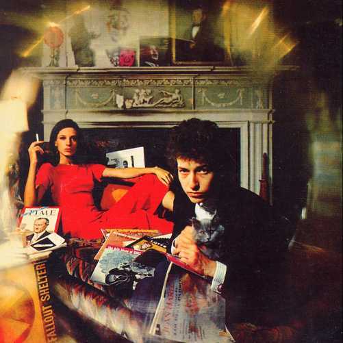
Bringing It All back Home, Bob Dylan, 1965
Photographer: Daniel Kramer
Dylan caused an uproar when he played an electric guitar at the Newport Folk Festival. Many followers felt betrayed by the man they considered a poet and prophet. Side A of BIABHSeeger. But now, we have a sophisticated Dylan, almost Edwardian in dress, paired with a sophisticated woman (his managers wife, Sally Grossman), in front of a classical mantel, sitting in a leather chair. The artifacts reference the songs, particularly, is acoustic, but Side B is electric, Dylan's first electric recording. Both Dylan and the recording company, Columbia, recognized that the cover art needed to reflect this dramatic change in Dylan's music, the "emergence of a new rock-laden and quasi-psych influenced change of course". (It was the first Columbia cover that did not list song titles on the front.) Dylan chose to work with his friend, photographer Daniel Kramer to create a new image. Previous covers had been black and white or fairly monochromatic affairs with the folksinger and his guitar (and in one, a girl). He looked working class in the mold of Woody Guthrie and Pete She Belongs to Me. There are 3 albums in the photo. One by Robert Johnson (a famous Delta Blues man), one by Eric vonGrossman, Dylan's previous album, Schmidt( a folk-blues guitarist and artist), and, tucked in behind Sally Don't Look Back. Kramer also points to the use of rich, saturated layers of color as the symbol of the "technicolor" of Dylan's new sound.
Thursday, November 1, 2007
Ching Shading Exercises 11.01.07
These are 3 drawings exercises from Ching which use shading to transform 2-D objects to 3-D. I enjoyed this exercise. I particularly like the effects of stippling. I had trouble turning the triangle into a cone.


Subscribe to:
Posts (Atom)