We started working with shading yesterday. Our assignment was to make two drawings, using a different style of shading in each. I've always been amazed at how the slightest variation in shading brings life and dimension to a drawing. I have a LONG way to go.
For these drawings I went very simple: an egg and a yoga block . I used diagonal shading for the egg, and random shading for the block.
Wednesday, October 24, 2007
Monday, October 22, 2007
Self portraits
Our assignment IAR 101 this week was to mount a display of 8 (!) self portraits. No limits were placed on the materials we could use. The total floorspace of each display could be no more than 3.24 square feet (e.g. an 18" X 18" square).
This exercise was very challenging for me. I took 7 very different approaches. (Two were variations.) My vision definitely exceeded my skills! April suggested that each sketch take no more than 30 minutes. At first I took a lot longer than that, but then I stayed within the limit. That freed me up to go with an idea and not stress so much about "being perfect". I sure admire Jake, Suzanne , and others who can whip up interesting, accurate, lively sketches in a few minutes. I'd like to get to that point so that I can add a visual component to my daily journals and the ones I keep for our family.
So here they are:
The center is my own, using a mirror. The top is after an Art Nouveau picture I found. The bottom is inspired by Picasso's Blonde Model.
This is a mix of drawing and a photo.
Another Mobius iteration. This time as a piece of playground equipment.
The words on the right are from a Mary Oliver poem, The Summer Day. "...I don't know exactly what a prayer is/ I do know how to pay attention, how to fall down/ into the grass, how to kneel down in the the grass/ how to be idle and blessed, how to stroll through the fields/Which is what I have been doing all day/ Tell me, what else should I have done?/ Doesn't everything die at last and too soon?/Tell me, what is it you plan to do/ with your one wild and precious life?"
This is Diana the Huntress who captivated me in my nature, wood-nymph youth. And Diana Rigg, who played Emma Peele on The Avengers. She was smart, independent, mysterious, and she was no damsel in distress. She could fight and shoot a gun. And she looked great in leather. Another childhood hero.
These two are plays on Norman Rockwell's "Three Self-Portraits". It's about my self delusions on a good day and on a bad day. The figures in the good day are Georgia O'Keeffe, Jane Goodall (another childhood hero), and Johnny Depp. On the bad day, the Wicked Witch of the West, Shrek, and a very fat cat.
Part of my psyche--do I act from fear or reason?
My stand is made from wood and dowels; the drawings are attached with clothes pins. I was thinking of self-portraits as a kind of "airing your dirty [or not] laundry" and wanted the stand to resemble a small wooden clothes-drying rack.
Saturday, October 20, 2007
Designer/Architect Websites
Website: Henrybuilt
Type of Company, Location: Kitchen cabinets and storage systems, tables and seating, serving and media cabinets. Classical modern style. Seattle (home base),New York, Los Angeles.
Type of Information Provided: Info on products, design and engineering of the products and systems, customer service options for purchase and installation. Also areas for press contacts, clients, showroom locations, and job openings.
Graphics/Organization of Site: Minimalist. No more than 2 paragraphs of text on introductory pages, and lots of white space on all pages. Text is concise and informative. Text font is easy to read. Black and gray color scheme. Easy to navigate. Good photos show details of pieces and how they fit together to work as a system.
Website: 2 Form Architecture
Type of Company, Location: Architectural firm designing residential and commercial properties with emphasis on sustainability. Eugene, Oregon
Type of Information Provided: Architects, projects, design philosophy, sustainability, news articles about the firm.
Graphics/Organization of Site: The site is clean with well organized pages. Easy to navigate; every page has a navigation bar as well as contact information. The font was too small for me to read comfortably. The photos of projects are well chosen to highlight specific features of each project. I would have liked more written information for each project.
Website: Aleks Istanbullu Architects
Type of Company, Location: Architectural firm. Residential, community, adaptive re-use, urban design and mixed use. Santa Monica, California
Type of Information Provided: Design philosophy, awards, publications, contacts. Projects including competitions and urban planning ideas.
Graphics/Organization of Site: Well organized. Home page is gray and black except for the word, "architects", which is in red. The black and white photos transform to color as you scroll over them. All project pages use the same layout. The consistency adds to ease of use. The pages include a photo on the left and text on the right with plenty of white space. The firm's name is in the top left corner (where your name always belongs on a paper!) and a navigation bar runs along the top. On the far left is a "back" icon and a "contact" icon. This site was a pleasure to look at and play around in because of the clean lines, ease of navigation, and very cool projects.
Website: ChrDAUER Architects
Type of Company, Location: San Francisco. Residential, commercial, and avocational design
Type of Information Provided: Projects, awards, design philosophy, contact information, and a password protected space for clients.
Graphics/Organization of Site: Layout is very clean. Project tabs are at the top of each screen and at the bottom: home, about us, contact, and client access. The center of the screen is a rectangular band divided into text and pictures. The text is white on a burnt orange background and is easy to read. All rectangles are softened with rounded edges. On the home page, the 3 photos change automatically to show a variety of projects. The site is easy to navigate, has concise text, and excellent photos of projects. One of my favorite sites.
Website: NBBJ
Type of Company, Location: Beijing, Columbus, Dubai, London, Los Angeles, New York, San Francisco, Seattle, Shanghai. Interior design for: civic, commercial, corporate, higher education, healthcare, science, sports, and transportation buildings
Type of Information Provided: Projects in various market sectors listed above, services offered, description and location of their offices, information for job seekers, contact information, awards.
Graphics/Organization of Site: This site was sort of off putting and it took me a while to figure out their navigation system. Instead of "home" they have "menu" with 5 headings. Click on one of these and then you get sub menus. It's just not quite as intuitive as some other sites I've used. I don't like the black background--the overall feel of the site is dark and somber, and the pages feel disjointed. One neat feature is well produced video of clients talking about projects.
Website: Mancini Duffy Architecture and Design
Type of Company, Location: 170 member firm, 86 year old firm. New York, Connecticut, New Jersey, Washington, DC., London UK. Commercial architecture and interior design.
Type of Information Provided: History of company, mission statement, staff, client list, awards.
Graphics/Organization of Site: This is a well designed site. The home page has an orange rectangle with photos and the menu to the left. The orange is solid at the left side, but becomes textured with a grid, which fades to white about halfway across the page. The 3 photos on the homepage change automatically. Projects are listed by sector (accounting & consulting, government, retail, and so on). The text was white on orange and easy to read. It was thorough, but concise. The site was easy to navigate. The big problem I had with it was encountering error messages when trying to open several pages. This happened both times I went to the site, several days apart. Not a good thing for the firm.
Website: I. Michael, Interior Designer
Type of Company, Location: Maryland, Virginia, and Washington, D.C. Residential, commercial, and hospitality interior design
Type of Information Provided: Projects, awards & publications, "about us", contacts, links.
Graphics/Organization of Site: Like NBBJ this site had a black background which just looked dull and unimaginative. The text was gray, scrolling turned it orange. There were three big problems with this site. First, the really well-designed i've looked at have all text and graphics in a shape (usually a rectangle) that fits well within the boundaries of the screen. All information fits on the smaller screen and if you have to scroll down there is an arrow provided. In effect the text comes to you, rather than you having to chase the text down the screen. The I. Michael site did not have this feature, and it scrolled more like a blog. Gave it a bit of an unpolished feel. Second, none of the photos, which were dramatic and well composed, had any kind of caption or identifying information. Finally, although the list of links was a nice feature, it would have been more helpful to have them grouped by type (furnishings, firms, etc.).
Website: Interior Reflections
Type of Company, Location: Houston, interior design mostly traditional style
Type of Information Provided: "About Us", FAQs ("My husband keeps suggesting I call a designer. ... What can Interior Reflections do for us quickly, inexpensively, and still have a dramatic result?"), "Ideas" (DIY how-tos), her projects, a sign up for free newsletter, monthly specials (e.g. a two hour sprucing up of one room using items you already own), and contact information (e-mail Beth).
Graphics/Organization of Site: This site looks and reads more like a home magazine, a combination of Better Homes and Gardens and Traditional Home. It appeals to those who like decorating themselves as well as those who want to hire a professional. The layout has a banner masthead with the company logo and, " Creating Fine Interiors Since 1982", plus photos of projects. The text is in two columns. It features the specials, free newletters, and monthly specials mentioned above, as well as pictorials of before and after makeovers. These are staples of HGTV and home magazines. The text is cozy and chatty. It's tone is welcoming and cozy and probably is perfect for the clientele she seeks--people who like "gracious living" in a traditional American (with a splash of trends like Tuscany) style.
Website: Design Synthesis, Residential and Commercial Interiors
Type of Company, Location: Los Angeles, Interior Design Firm
Type of Information Provided: Profile of owner, Fran Kerzner, Projects, Contact, News & Appearances (her work has been featured on HGTV).
Graphics/Organization of Site: This site is less detailed than many others I looked at. It doesn't include much about her philosophy or approach with clients. There is no list of clients. It's not extensive, but it is a good introduction to her work.
Website: Richard Schultz
Type of Company, Location: Outdoor furniture based on designs of Richard Schultz. Pennsylvania.
Type of Information Provided: About Us, including a video bioraphy of Richard Schultz and his son Peter. Our Garden featuring the furniture set in the garden of the family's 250 year old Pennsylvania farmhouse (love the garden chairs piled with snow!). Product lines. Dealers. Contact information. A password protected area for people who register--can get downloadable brochures and other literature.
Graphics/Organization of Site: This sight is as lean and minimalist as the furniture it showcases. The background is white and, although each screen is organized, there are no visible margins, borders, etc. All text is black except the Richard Shultz logo which is a green rectangle with his signature in white. The mission statement and primary contacts are also in green. The home page has the menu and an animated graphic of the rocking chair that is part of their new line. This alternates with images of other products. Text is spare, but informative. This site is a perfect match for the form and spirit of the designer and the chairs he created.
Thursday, October 18, 2007
Zine IAR 110 10.18.07
Our assignment was to create a zine using one of our design research topics as its focus. I chose Interior Spaces, Bedrooms. Bedrooms don't have all the nifty gadgets and widgets of bathrooms and kitchens, and I wanted to look at the ways people approached a space mostly used for sleep, intimacy, and relaxation.
I usually go minimalist in my design and this time I wanted to be a little more abundant. So I often have more than one photo per page and I included the thumbnails and Beatle quotes to add a unifying element and a fairytale-like mood. The result is okay, but not as satisfying as I'd hoped. The need for absolutely, totally straight edges is painfully clear in a couple of places. If I did this again I would either choose a more forgiving layout or I would mark up each page (like we used to do for out high school newspaper and measure every cut and paste to the nearest 32nd inch.
Friday, October 12, 2007
Metamorphosis IAR 101 10.12.07
The Assignment: This was a very interesting project. The task was to fuse two objects that were randomly selected (the name above and the name below our own on the iar blog site). After choosing the two objects and the qualities/elements we wanted for emphasize, we made three objects. One was to draw from each object about half and half. Then using the first object and this "middle" object we made a second object. Finally using the middle object and the second person's object we created a third.
So it looks like:
Object Person 1 (OP1)
Mix 1 (OP1--half & half)
Middle (half OP1, half OP2)
Mix 2 (OP2-half&half)
Object Person 2( OP2)
It took a while just to decide which two objects to work from. I chose the Memory Boxes from both Sara Z's and Shannon Heggar. (I couldn't get images from their sites to copy so I only have the links. Sorry.) I chose to work with the colors from each: gray, black, and pink and the textures: the woven surface of Shannon's and the spikes of Sara's.
Ideas and Iterations: Here are all the ideas I had--in Studio, in my car (not moving!), at McDonald's, and in the middle of the night.
And here are my 3.
The first is mostly Sara's with a gray stripe added to introduce Shannon's. (I had a lot of trouble with the photos and they are not the quality I would like. Here , for example, you can't see the spikes inside the box. But they are there!)
The second has a roughly 50/50 ratio of pink (Sara) and gray (Shannon). It still has the black interior of Sara's but has now lost all the spikes.
Finally the third box is all gray except for a single strip of pink around the bottom. The interior walls are made of the basketweave and the inerior bottom is solid gray.
So I went from a pink, black, and spiky object to a predominantly gray, soft one. And from an object with unexpected "danger" to one of soft, domestic, safe feel of basketweave.
Lessons Learned: If I worked on this more I would do the second basket again to spiff up the craftsmanship. By the last box I had a good methof worked out for this style of woven box. Even though the second box was really my 3rd or 4th try at it (see picture below), it wasn't until the last on that I think I got it. (I must have been daydreaming in kindergarten on the day we learned this technique!) I also felt a bit of a discontinuity because of the shape. Sara's was a cube, mine were rectangular, and Shannon's was a curvilinear triangle. It would be interesting to try to morph from cube to triangle.
Templates for plain box and basketweave box
Practicing the basketweave.
If you don't like your photos, color them, filter them, and saturate them! Much better!
Thursday, October 11, 2007
Composition IAR 110 10.11.07
Our assignment was to find a 2-page print layout that we liked and duplicate it using our own choice of graphics and text. Our pages focussed on, "What is Studio?". The image I found was in the October 2007 issue of The World of Interiors.
I like the simplicity of the layout and the equal weight given to text and the photo. (The shadowy stuff in the background is bleed through from the scanner. I tried blocking it with paper, but it came through anyway.)
So here's my version. I used their text as a template because I thought it was strong and gave me a good way to describe Studio. I used 4 photos to show different aspects of Studio, but arranged them in a rectangle that roughly imitates the original dimensions. I must have proofed this tiny bit of text (and made minor changes 20 times--yet...can you find the typo?!)
Saturday, October 6, 2007
10 Buildings
Chateaus de Versaille
Location: Versaille, France
Year(s) built: 1661-1774
Architects/Designers: (1st round) Louis Le Vau, architect. Charles Le Brun, interior designer. Andre Le Notre, landscape architect. (2nd round) Jules Hardin-Monsart
Type/ purpose: royal residence and palace for King Louis XIV
Style: Baroque
Unique/interesting features: More is never enough with Baroque design especially for Louis XIV. Every inch of wall and ceiling are painted with designs, portraits, and allegorical murals. Sixty-seven staircases in the (then) new style of open stairwells let in light, improved movement through the spaces, and gave people a place to be seen. Louis XIV moved his entire government out of Paris and into Versaille, which at its peak, housed 5000 people. The grounds included tremendous areas of formal gardens. Landscapers created geometric shapes with parterres (planted beds framed with hedges). Fourteen hundred fountains with water provided by the Seine River were scattered thoughout the gardens and paths.
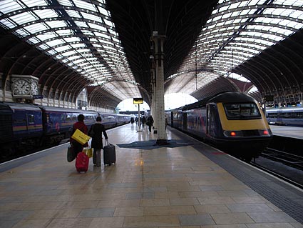
Paddington Station
Location: London, England
Year(s) built: 1852-1854
Architects/Designers: Islamband Kingdom Brunel (his name sounds like a country!) Born in Portsmouth, England (b.1806-d.1859) he was an engineer/architect. After working many years for his father, he was appointed chief engineer of the Great Western Railroad in 1833. He was a prolific designer of tunnels, railways, bridges, prefabricated buildings, and ships. He expanded the use of iron and used wrought iron and cast iron for, what were then, new purposes. He is considered one of the key figures in bringing about the Industrial Revolution. The ornamentation of Paddington Station was done by Matthew Digby Wyatt, because Brunel felt is was the one area of building for which he had little talent.
Type/ purpose: Train station (still operational)
Style: Victorian
Unique/interesting features: Made of wrought iron and cast iron. High, arching ceilings allow for air circulation, and a feeling of spaciousness. Light enters through glass ceilings.
Empire State Building
Location: New York, New York
Year(s) built: 1931 (in middle of Great Depression)
Architects/Designers: Shreve, Lamb, and Harmon
Type/ purpose: Commercial office tower, skyscraper
Style: Art Deco
Unique/interesting features: Built as testament to American strength and resiliency during Great Depression. At 102 stories it was the largest building in the world from 1931-1972 when the World Trade Towers were built. Materials include: 60,000 tons of structured steel; 200,000 cubic feet ofIndiana limestone and granite. Design: The setbacks offset the optical illusions of height and emphasize the tower. Interior: The lobby is 5 stories tall, an "art deco masterpiece" of granite, marble, and brushed stainless steel. It has huge bronze medallions to celebrate the laborers and craftsmen who worked on the building (about 100 workers died during construction). A metal mosaic shows the Empire State Building as the center of the Universe.
The Robie House
Location: Chicago, Illinois
Year(s) built: 1909
Architects/Designers: Frank Lloyd Wright
Type/ purpose: family residence
Style: Prairie Style
Unique/interesting features: The quintessential Prairie Style house. Exterior: Flat, low-pitched rooflines with long overhangs covering multiple patios and porches. Wright calculated the pitch and length of the overhangs so that rooms stayed shaded in the summer. Horizontal lines predominate; even the brick joints are raked on the horizontal. Interior: House has 3 levels. Rooms on a grid system. Dining and living areas on the main floor are really one space divided by a fireplace and chimney. Bedrooms are on the upper level, and a playroom and billiard room are on the lower level. There is no basement. Decor: Wood furniture, stone fireplace and chimney. ceilings have are wood supports with white plaster (?) panels, which reminded me of the ceilings in medieval English halls. Many windows have stained glass accents. Great Buildings.com notes that there is a "high degree of integration of the mechanical and electrical systems designed by Wright into the visual expression of the interior". This is intriguing, but I found no more info on it. Are the ducts, etc. visible?
Bag End (Hobbit Hole)
Location: The Shire
Year(s) built: 2889 Third Age
Architects/Designers: Bungo and Belladonna Baggin's (Bilbo's parents)
Type/ purpose: Home
Style: Hobbit Hole (Earth sheltered structure)
Unique/interesting features: "His house was perfect, whether you liked food, or sleep, or work, or story-telling, or singing, or just sitting and thinking best, or a pleasant mixture of them all."
Bilbo's house was an earth-sheltered ( and therefore highly energy efficient) hobbit hole with a green door and a large brass door knob. Round windows let in light and warmth, perfect for an afternoon nap. The home had "countless rooms": bedrooms, bathrooms, dining rooms, living areas, rooms for clothes, and many pantries for storing comestibles. The ceilings are white plaster with wood . They are arched, and tall enough for a human or wizard to stand with just a whisper of a stoop.
Dogtrot House
Location: Upland south, Louisiana and Florida, Appalachian mountain region
Year(s): Pre-civil war
Architect/Designer: Vernacular
Type/purpose: House
Unique/interesting features: These one-story houses were characterized by an open breezeway (dogtrot) that ran through the middle of the structure from front to back. The dogtrot was flanked on either side by rooms. They sometimes had rear shed rooms. A chimney was placed at each end of the building, and a front porch ran its length. The breezeway coupled with exterior windows in each room provided a type of passive cooling system of cross ventilation. This symmetrical structure was a "frontiersman's attempt to build a formal, ... Georgian central hall house" (see site).
Azuma House
Location: Osaka, Japan
Year(s): 1976
Architect/Designer: Tadao Ando
Type/purpose: Row House
Unique/interesting features: This is a one bedroom, one bathroom home in an urban neighborhood. It is 10.5 feet wide and 42 feet long with a total of about 700 square feet on two floors. Because only the front living room faces the street and the rest of the house is organized around a central courtyard behind the living room, the house is buffered from the "hustle and bustle" of the city. All the rooms open onto the courtyard which provides natural light and cool breezes in a semitropical climate.
Charles Moore House
Type/purpose: House
Location: Orinda, California
Year: 1962
Architect/Designer: Charles Moore
Type/Purpose: Neo-vernacular house
Unique/interesting features: The original house was 25 feet square. It was supported by steel trusses with a wood frame. Sliding walls opened the house to the outside. The interior was organized around two aedicules which divided the areas of the house. The cantilevered roof had dramatic overhangs which seemed to float over the house. Moore bought the house because he though the site "seem[ed] full of magic". He was inspired by the "primitive" huts of Mayan and Hindu temples and the Trenton Bathhouse by Louis I. Kahn. The house was "drastically remodeled" in 2006 (pictured).
Frank Gehry House
Type/purpose: House
Location: Santa Monica, California
Year: 1978
Architect/Designer: Frank Gehry
Type/Purpose: Deconstructivist
Unique/interesting features: Yep this house, set in the suburbs, has Frank Gehry written all over it. Gehry bought an existing house and wrapped it in corrugated metal with accents made of chain link fencing. He added large glass openings off square. It is a conglomeration of angles and slanted roof lines. Like most of Gehry's work the house is more sculpture than architecture. Gehry was influenced by Robert Rauschenberg; as a result his buildings often look like metal and glass collages.
Friday, October 5, 2007
10 Designers/Architects
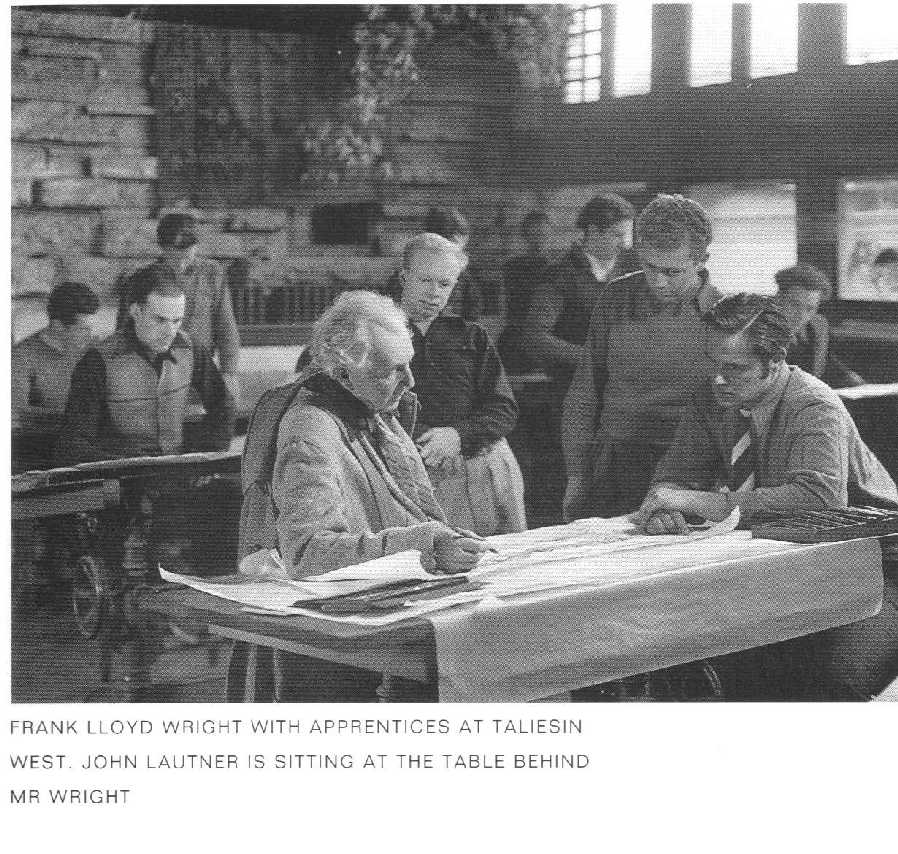
John Lautner (1911-1994) was born in Michigan and was deeply inspired by the beauty of the northern woods and the blue waters of Lake Michigan. He spent his professional life exploring the "relationship of human beings to space and of space to nature". He wrote that we should work to create a "beautiful architecture...to daily increase the joy in life."Architecture should be "alive, fresh, and exhilarating" as well as "solid and enduring." Lautner never graduated from an accredited school of architecture, but he apprenticed with Frank Lloyd Wright for six years, and collaborated with him on many projects. His work reflected Wright's ideas of fitting buildings into a landscape, using a human scale, and incorporating natural materials and views into design. After he finished his apprenticeship much of Lautner's work was in Los Angeles, although he designed buildings for places as far away as Australia. He moved far beyond the Prairie Style, using organic and often dramatic, geometric shapes in buildings. Large, clear span interiors are found in many of his structures. He considered concrete to be the ultimate building material because it could take on so many shapes.
His most famous house may be the Chemosphere House (see photo, above) which the Encyclopedia Britannica calls, "the most modern house" ever built. And, in fact, it looks as if it were taken straight out of the Jetsons (or more likely, the Jetsons' house was inspired by the Chemosphere House.) Other significant buildings include: Silvertop, the Sheats house, the Arango house, the Elrod residence, the Segal residence, and the restaurants Henry's, Googies, and Tina Naylors.
Frank Lloyd Wright (1867-1959): Wright is arguably the most well-known American architect, and Fallingwater (above) one of our most recognizable residences. Wright was born in Wisconsin and attended a few semesters at the University of Wisconsin in the School of Engineering. He never graduated, instead he moved to Chicago and worked for a short time in the offices of J.B. Silsbee, before working at Adler and Sullivan. He was greatly influenced by Louis Sullivan's dictum that, "Form ever follows function" and that architecture should reconcile nature with science and technology.
Wright is most noted for the Prairie Style houses. These were low structures, usually L or T shaped, with strong horizontal lines, intended to merge into the flat mid western landscape. Materials included brick, wood and plaster. The interiors were usually built around a central chimney. Rather than closed off, separate rooms, Wright created broad open spaces delineated by screens, shelves, and other furnishings. His rooms were "overlapping and interpenetrating with areas of shared space." The Robie House is considered the epitome of this style.
He involved himself in the interior details including fabrics, stained glass, furniture, and carpeting, and even went so far as to sometimes design clothes for clients. All this whether the clients wanted him to or not! He fervently believed that, "the architect is the maker of men" and he meant to design environments that met his vision of a supportive space. He said, "Early in life I had to choose between honest arrogance and hypocritical humility. I chose the former and have seen no occasion to change." It's interesting that a man so committed to creating human spaces, and spaces that merge with natural settings was himself so rigid.
Wright's home and studio in Wisconsin, named Taliesin was filled with apprentices, including John Lautner (see previous entry). A fire started by a servant killed his wife and several members of his household and destroyed the buildings. Later, Wright built Taliesin West as a winter retreat in Arizona.
Wright focussed on residences, but two non-residential buildings were so influential here and in Europe that they helped bring the art-nouveau movement to an end, and provided a new direction in architecture. These buildings were the Larkin Administration Building in Buffalo, NY and the Unity Church in Oak Park, Illinois.
Doris Leeper (1929-2000) Leeper was a painter and sculptor, and so not technically a "designer". However, she has been important to me, as she opened my eyes and mind to what art can be. In 1962 my mother bought one of her paintings, The Quarry. It's roughly 4' by 5', a sweep of whites and blues, roughly textured. I loved the colors, the motion, and the way I could see the form even though it was not "realistic". In the conservative climate of Raleigh, NC in 1962 it was one of a kind.
Leeper did a series of Quarry paintings and later moved on to sculptures. She moved to New Smyrna, Florida where she founded both an artists' colony, the Atlantic Center for the Arts, and was instrumental in creating the 57,000 acre Canaveral National Seashore. Her estate donated over 100 pieces of her work to the University of Central Florida College of Arts and Sciences.
Richard Neutra (1892-1990). Neutra was born in Vienna, Austria but he later lived and worked in California. Contemporaries and influences included Le Corbusier, and Ludwig Mies van der Rohe. He is recognized as introducing the International Style to Southern California and for introducing Los Angeles architecture to Europe. He was trained not only in design, but also in methods of construction. This knowledge allowed him to design and build on very steep slopes and to use materials in daring and dramatic new forms. He worked mostly in residential design, and his most famous home is the Lovell house (picture above). This house, like many of his structures, incorporated metal frames finished with stucco. Much of the structure was made off site and then brought to the site for construction. The house was industrial-looking, and pavilion-styled with sweeping flat surfaces. Two big "wow factors" in the Lovell House were the balconies that were supported by thin cables slung from the roof line, and a U-shaped concrete "cradle" for the pool. His patios, porches, and balconies blurred the boundaries between inside and outside. Another important Neutra residence is the Kaufman house. (Are these the same Kaufman's that owned Fallingwater?!)
Peter Gluck (currently practicing): Peter Gluck is an unapologetic modernist. He cites AlvarAalto and Louis Kahn as his "architectural heroes". He also spent several years in Japan after graduating from the Yale School of Architecture, and a subtle Japanese Modernist sensibility can be seen in many of his buildings.
He is an outspoken critic of the American Institute of Architecture, (AIA )and the architectural industry in general, believing it is too concerned with legal liability and farmed out actual construction to contractors. He believes the AIA is less interested in practicing architectural excellence than it is in promoting and protecting its members. Gluck, in contrast, holds that the architect should be responsible of all phases of creating a building. So his company, Architectural Construction Services, provides services from concept through design and construction at an "affordable cost". Whereas he once designed homes for upper income clients, he is now deeply committed to creating homes and communities that are affordable to middle and lower middle income families. The Little Ajax Affordable Housing Project in Aspen is one of these (picture above). Ironically, the AIA gave Gluck an award for this development based on its green/sustainability features.
Oscar Niemeyer (1907- ). Brazilian architect Oscar Niemeyer is most noted for his work on the United Nations Building in New York City (along with Le Corbusier and others in 1947) and for being the chief architect of the city of Brasilia, which was created on barren land in the center of Brazil as its new, modern capital in the late 1950s. In collaboration with Le Corbusier, he designed the first state sponsored skyscraper: the Ministry of Health and Education in Rio de Janeiro. (above). Although a modernist he was also influenced by Brazilian Baroque. He used the very new material of reinforced concrete to create dramatic and sensuous concave and convex curves. He called his style "Ionic" modern and compared to the "Doric" blocky forms used by many of his contemporaries. The Copan Building in Sao Paulo (picture below) is a good example. Some have criticized Niemeyer for being more of a sculptor than an architect. Regardless it's clear he has created an architecture for Brazil that has influenced design around the world.
Eero Aarnio (b. 1932) Born in Finland, Aarnio studied at the Institute of Industrial Arts in Helsinki from 1954-1957. Aarnio did much to define the look of the 1960's. He explored the organic shapes and vivid colors that can only be manufactured from plastics. He created the Ball (above), the Bubble, and the Pastil chairs--all from molded plastic. His designs are playful and engaging.
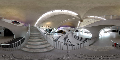
Eero Saarinen (1910-1961): Another great Finnish architect and designer, Saarinen studied in Paris and in the U.S. at Yale University. His first interest was sculpture, but then he chose to study architecture. He worked with his father , Eliel Saarinen, until his death.
The younger Saarinen used unique and innovative shapes, but always kept his buildings practical and functional. He moved between the International Style and Expressionism. His buildings often featured dramatic curves and cantilevers. The most famous building was the TWA terminal (and above) at JFK Airport in New York.
Saarinen also designed a collection of furniture in collaboration with Charles Eames for a Museum of Modern Art (MOMA) competition in 1940. He later developed a successful line of furniture for the Knoll International.
Charles Eames (1907 -1978) and Ray Eames (1912 -1988) were a married couple famous for furniture design, particularly the Eames Chair. They also created puzzles, children's toys, films, and the iconic Eames House and theEntenza House in the Pacific Palisades. In 1941 Charles was a set designer for MGM studios. "Open, organic, and emotionally expressive" were the hallmarks of their designs and of their lives. Their first designs were made of plywood, fabricated in a spare room of their Neutra apartment. Once they began making money and had a separate studio their use of materials expanded to fiberglass, plastic, and aluminum. Much of their furniture was sold to "Corporate America" and was a status symbol for executives. This was true of the Eames Lounge Chair manufactured by Herman Miller.
However, the Eames also made more folk crafted works that the sold in the U.S. and India. See this site for a lively biography of the couple. The Eames also made the spectacular film, Powers of 10, which is a wonderful visual guide to --well--powers of 10. I used this in my math class one year and the students really loved it. Cool! I had no idea about the Eames connection!
After Charles died in 1978, Ray continued to work on projects that they had already started, but she did not take on any new projects. She died 10 years to the day after her husband.
Proximity Hotel--Dennis Quaintance (developer/owner)
Dennis Quaitance, (currently practicing): Dennis Quaitance, is not an architect but he had embarked on career of designing hotels and restaurants. He,along with Nancy King Quaitance and Mike Weaver are the owners of Quaitance-Weaver Restaurants and Hotels. They designed, own and operate Lucky 32 Restaurant, the Green Valley Grille, and O'Henry's hotel all in Greensboro, NC. Now they are opening the Proximity Hotel which will be only the 2nd hotel in the country to achieve the gold level rating from Leadership in Energy and Environmental Design Green Building Rating System.Quaintance started out as a housekeeping assistant in Missoula Montana at the age of 15, and over the years worked his way up in the hotel and restaurant industry, gaining experience for a number of 4 and 5 star hotels and restaurants.
Subscribe to:
Posts (Atom)